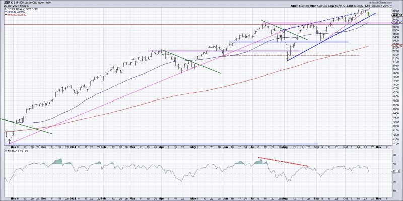
Unlock Your Investment Potential with These 3 Visualization Techniques
In the ever-evolving world of trading and investing, being able to accurately assess market phases is crucial for making informed decisions. One such phase that traders often look out for is the distribution phase, where assets change hands from strong hands to weak hands before a potential downward trend. Visualizing the start of a distribution phase is key to ensuring that traders can adjust their strategies accordingly. Here are three ways to effectively visualize the beginning of a potential distribution phase:
1. **Market Volume Analysis**: One of the most reliable ways to start visualizing the beginning of a distribution phase is by analyzing market volume. An increase in trading volume during a period of sideways movement or consolidation may indicate that accumulation is shifting towards distribution. By using volume indicators such as OBV (On-Balance Volume) or Accumulation/Distribution line, traders can identify divergences that signal a potential change in market sentiment. Increasing volume during price pullbacks or a lack of volume during price rallies can be early warning signs of distribution.
2. **Price and Volume Chart Patterns**: Price and volume chart patterns can provide valuable insight into the start of a potential distribution phase. Traders can look out for specific patterns such as the Head and Shoulders pattern, Double Tops, or rising wedges, which are commonly associated with distribution phases. These patterns often indicate that demand is weakening, and supply is starting to dominate the market. By understanding and recognizing these chart patterns early on, traders can make informed decisions to protect their positions or even capitalize on potential downside movements.
3. **Relative Strength Analysis**: Another effective way to visualize the beginning of a potential distribution phase is by conducting a relative strength analysis of the asset in question compared to its industry peers or the broader market. A consistent underperformance of the asset relative to its peers, despite overall market strength, could be a sign that distribution is underway. Traders can use relative strength indicators like the RSI (Relative Strength Index) or Price Relative to gauge market sentiment and assess whether the asset is losing investor favor.
In conclusion, visualizing the start of a potential distribution phase is crucial for traders to adapt their strategies and protect their portfolios from potential downside risks. By incorporating market volume analysis, price and volume chart patterns, and relative strength analysis into their decision-making process, traders can stay ahead of potential market cycles and make more informed trading decisions. By paying close attention to these key indicators and patterns, traders can better position themselves to navigate the dynamic and ever-changing landscape of the financial markets.
